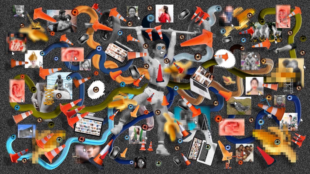
Certain Gen-AI tools, by allowing us to focus on our *intention* within visualizing data, can help us break free from the confining framework in which traditional mapping tools need to fit and restrict data.
This text is based in part of the thoughts and reflections form the CfD Conversation Series in the Northeastern University with Paolo Ciuccarelli, Enrico Bertini, Vidya Setlur: (Senior Director, Tableau Research) and Victor Dibia (Principal Research Software Engineer, Human-AI eXperiences (HAX) Team, Microsoft Research)
"To understand something is to understand its topography, to know how to map it. And to know how to get lost in it." — Under the Sign of Saturn, (Sontag, 1980).
Data floods more and more into every corner of our existence. Yet, as Susan Sontag eloquently suggests, true comprehension arises not just from mapping known terrains, but also from venturing and getting a bit lost into uncharted territories. Therefore, to fully understand data, visualizing it according to conventional methods might not always be enough. Instead, sometimes it is necessary to sail adrift in the great sea of data, in order to take a step back and recognize the most important motions and processes to address, looking at it with a fresh pair of eyes.
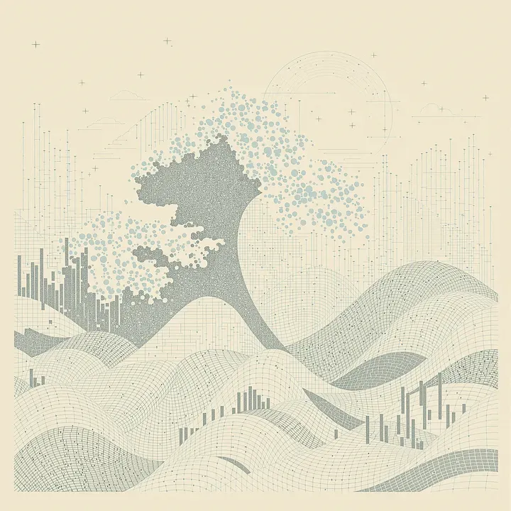
Today, I want to make a case for the potential of using Gen-AI tools to help data visualization bridge quantitative data with qualitative human experiences. Certain Gen-AI tools, by allowing us to focus on our *intention* within visualizing data, can help us break free from the confining framework in which traditional mapping tools need to fit and restrict data. This can help shift the focus towards the human portion of quantitative data, rather than mere numbers and statistics.
DISCLAIMER: I’ve spent a big part of the last two years researching and demystifying Gen-AI all over, from pointing out the ethical problems of non-consented use of images and texts for LLM production to the entangled biases and the dangers of hallucinations in mainstream tools such as Chat-GPT — but it’s too late to be just pessimistic, so this is one of a series of articles trying to find the right ways to use these tools.
READING DATA THROUGH A NEW LENS
We often interpret data under the influence of what might be termed as the “Cartesian anesthetic gas” ¹ — which we adapt here to describe a metaphorical haze that reduces complex realities to mere numbers and graphs. This reductionist lens, inherited from Cartesian dualism, encourages a separation between the quantitative and the qualitative, the measurable and the experiential. As a result, data is often stripped of its cultural, emotional, and humanistic contexts, limiting our understanding and connection from the reality that this data depicts.
In many instances, this approach leads to a myopic view where data becomes an abstract entity, detached from the very realities it aims to represent. At DDS, an important part of our work is to recognize that data simultaneously sustains societies and perpetuates systemic structures. This shows the ability of data to both aggravate inequalities and offer tools to reduce them.
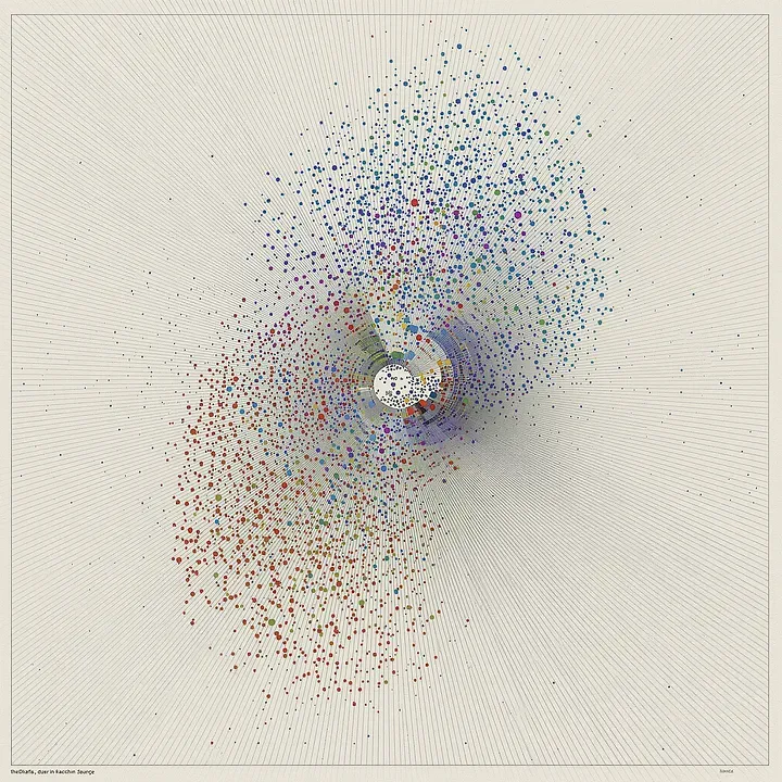
Surveillance capitalism has transformed data into a raw material, extracted and distilled through the millions of physical and digital interactions worldwide. Companies collect vast amounts of personal information, turning our behaviors and preferences into commodities. We often consume this data through dashboards, infographics, charts, and other visualization systems that, while efficient, sometimes fall short in depicting the full spectrum of realities they attempt to illustrate. These tools can oversimplify complex social phenomena, leading to misunderstandings or superficial analyses. The map, no matter how detailed, is always a reduction of the territory. Similarly, the “like” button on social media platforms can never encapsulate the wide spectrum of human experiences associated with genuinely liking or appreciating something. It reduces nuanced emotions to a single, quantifiable action, erasing the depth behind our interactions.
To truly understand and engage with data, we need to explore beyond these constraints. This exploration requires developing a multitude of strategies — alternative, dissenting, and interdisciplinary — that challenge conventional methodologies. By incorporating insights from academia, public and private organizations, and using technologies such as Gen-AI, we can try to look beyond these limitations of data.
Empowering users through adaptive tools/Command vs. Intent
One of Gen-AI’s most promising aspects is its ability to facilitate the development of tools that adapt to our thinking patterns, rather than force us to conform to rigid interfaces. In my case, this has transformed how I research, analyze, and create, turning it into a more intuitive and personal experience.
Traditional data visualization tools have long been rooted in a command-driven paradigm. Software applications like Microsoft Excel, Tableau, and programming libraries such as Matplotlib or D3.js require users to specify exact instructions to produce visual representations of data.¹ This process involves meticulous attention to detail: selecting chart types, defining axes, choosing color schemes, and adjusting numerous parameters to achieve the desired outcome. Users must know precisely what they want and how to command the tool to create it.
This emphasis on specificity and control can be both empowering and limiting. On one hand, it allows for precise customization and fine-tuning. On the other hand, it demands a steep learning curve and can constrain creativity by forcing users to think within the confines of the tool’s capabilities. Users must often focus more on the “what” can be technically depicted rather than on the “why” certain visualizations would be meaningful. This reduces data visualization to a mechanical exercise, rather than an explorative process where one can step back, get lost in the data, and organically uncover meaningful patterns and stories.
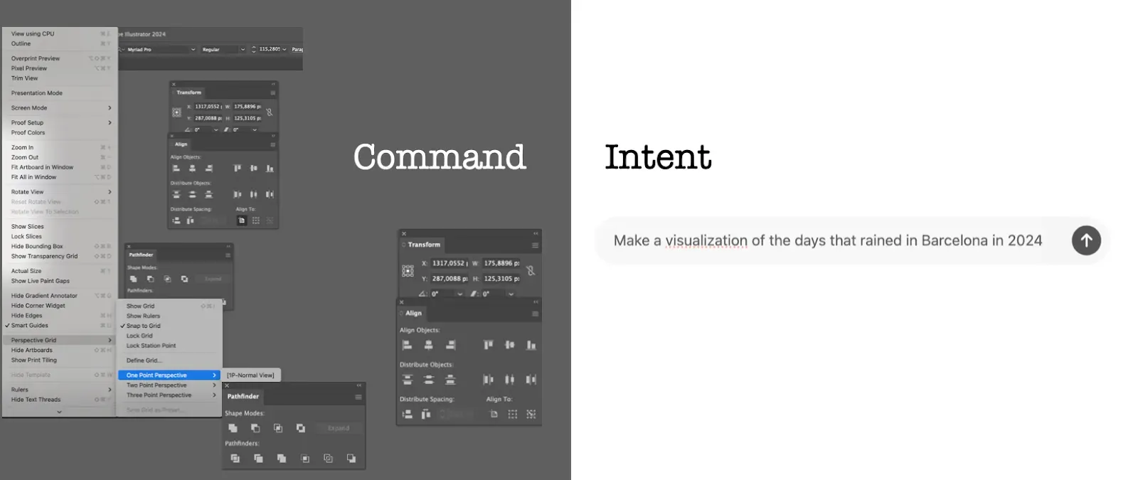
Interfaces like the ones developed by OpenAI or Anthropic, herald a shift from command to intent. Unlike traditional tools, these AI systems invite users to express their goals and motivations in natural language. Instead of dictating specific commands, users articulate their intentions, and the AI interprets these to generate the most probable outputs. The interaction becomes more about the why — the underlying reasons and desired outcomes — than the granular details of what needs to be done.
For example, a user might engage with GPT-4 by stating: “I want to visualize the impact of climate change on coastal cities over the next 50 years, highlighting areas most at risk due to rising sea levels.” The AI processes this intent, accesses relevant data, and generates a visualization that aligns with these goals.
This intent-driven approach offers several advantages:
- Focus on Purpose: By prioritizing the “why,” users can concentrate on the insights they wish to gain and the stories they want to tell through data.
- Accessibility and Inclusivity: Users without extensive technical expertise can participate in data visualization. Natural language interfaces lower barriers to entry, democratizing access to powerful analytical tools.
- Enhanced Creativity: AI can offer new solutions and unexpected representations which users might not have thought of when using traditional tools. This can lead to new perspectives through which to look at old data.
However, this shift also introduces some challenges:
- Interpretation Ambiguities: AI models still misinterpret user intent, especially if instructions are vague or ambiguous.
- Reduced Control Over Specifics: Users seeking precise control over every aspect of the visualization may find the AI’s abstractions limiting.
- Reliance on AI’s Understanding: The AI’s outputs are only as good as its training data and algorithms. Biases or gaps in the AI’s knowledge continue to affect the quality and accuracy of the visualizations produced.
The transition from command to intent represents a broader evolution in human-computer interaction. It mirrors the way humans naturally communicate and collaborate, focusing on shared goals rather than prescriptive instructions. This paradigm will shift a lot of data designers to think more holistically about their data and the messages they wish to convey.
Divergence and Convergence thinking
Every creative endeavor traverses two fundamental phases: divergence and convergence. During divergence, we open ourselves to new ideas, gather inspiration, and let our minds roam free. It’s a process of exploration and expansion — a “breathing in” of possibilities. Convergence, on the other hand, involves narrowing down options, refining ideas, and perfecting details — a “breathing out” of precision.
Most traditional creative tools — like Adobe Illustrator, Figma, or Excel — are designed for convergence. They excel in helping us polish and perfect, but they often fall short in fostering the exploratory phase of creativity. They are built to help us be precise, not to inspire unexpected ideas.
Gen-AI tools, such as NLPs like Claude or GPT4, or generative models like Stable Diffusion, disrupt this paradigm. They are inherently designed for divergence, sometimes generating outputs that can spark new directions in thinking. They can allow us to “breathe in” a vast array of possibilities, enhancing the creative process. However, these tools can also fall into the trap of offering a single, overly confident perspective, potentially limiting our view of the world. For example, GPT-4 might present a polished but narrow narrative based on the data it has been trained on, while tools like Perplexity, which aggregate multiple sources and perspectives, can help us maintain a broader lens, offering context and nuance that foster true exploration.
***
The perils of overconfidence in algorithms
This captures a key paradigm: Gen-AI offers an immense potential when it comes to bringing in new ideas and broadening the range of affordances, making it an invaluable, positive tool for divergence. And yet, it also presents significant challenges, which show that at the hour of discernment and decision-making (the convergence phase), it’s crucial to maintain the human component of critical thinking and holistic understanding.
Algorithms often deliver outputs with an air of absolute confidence, regardless of their accuracy. Unlike humans, machines lack subtle cues of uncertainty — hesitations, tonal shifts, or body language — that help us gauge the reliability of the information we are handed. That’s why, in most of the experiments we have been working on in the studio, we try to use Gen-AI as an adversarial agent: instead of solving the problem, we put it at the service of finding flaws to our hypotheses and insights, based on the data we have.
EXPLORING TEXT TO IMAGE VISUALIZATION
As the use of Gen-AI enables a wealth of new visualization languages and possibilities, I’ve been pondering whether we can visualize data in a way that not only conveys information, but also connects with the viewer on a human level. This question has guided our exploration into Generative AI and data visualization over the past year, to engage both our minds and emotions.
Here’s a link to our promptbook — a guide created for scientists, designers, journalists and storytellers, to inspire them to look through the lenses of data language when using text-to-image software.
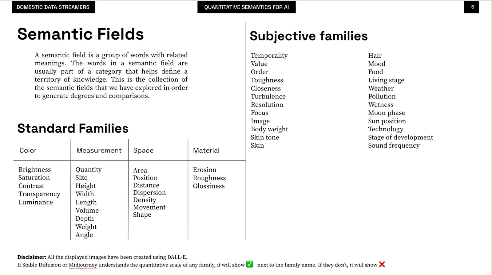
In 2022, we started experimenting with early text-to-image models to see how over 50 different semantic fields, enriched with more than 400 adjectives, could enhance data visualization. We drew inspiration from Jacques Bertin’s semiology studies², which gave us foundational variables like brightness, height, width, depth, and transparency. Bertin provided the building blocks; we just decided to see how far we could stretch them.


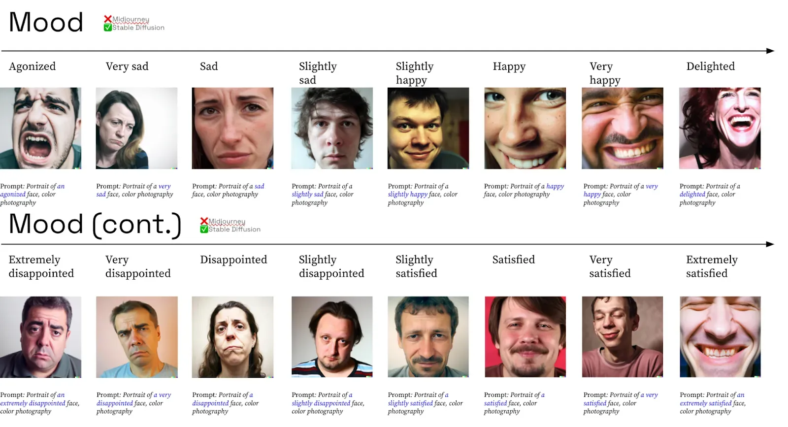
Building Your Own Semantic Family
In our “Prompt Book,” we explain how to build your own set of visual variables that match your data and message. It’s like assembling your own Lego set for data visualization. You’re not just following instructions; you’re creating something unique that speaks to your perspective.

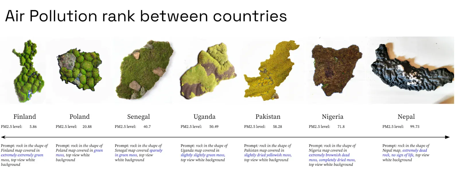
A Living Map: Visualizing Pollution Through Moss
One of our projects visualized real-time pollution data by turning it into images of moss-shaped countries. Instead of a static map, you got a living organism that grows or withers based on environmental health.
Seeing this visualization was like walking through a garden where each plant showed how well it’s cared for. It hit home more than any bar chart could. It was a striking reminder to take better care of our planet before all our moss — both real and virtual — calls it quits.
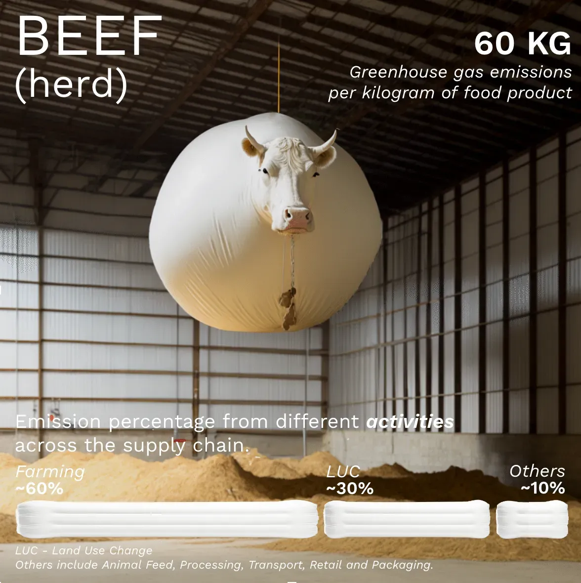
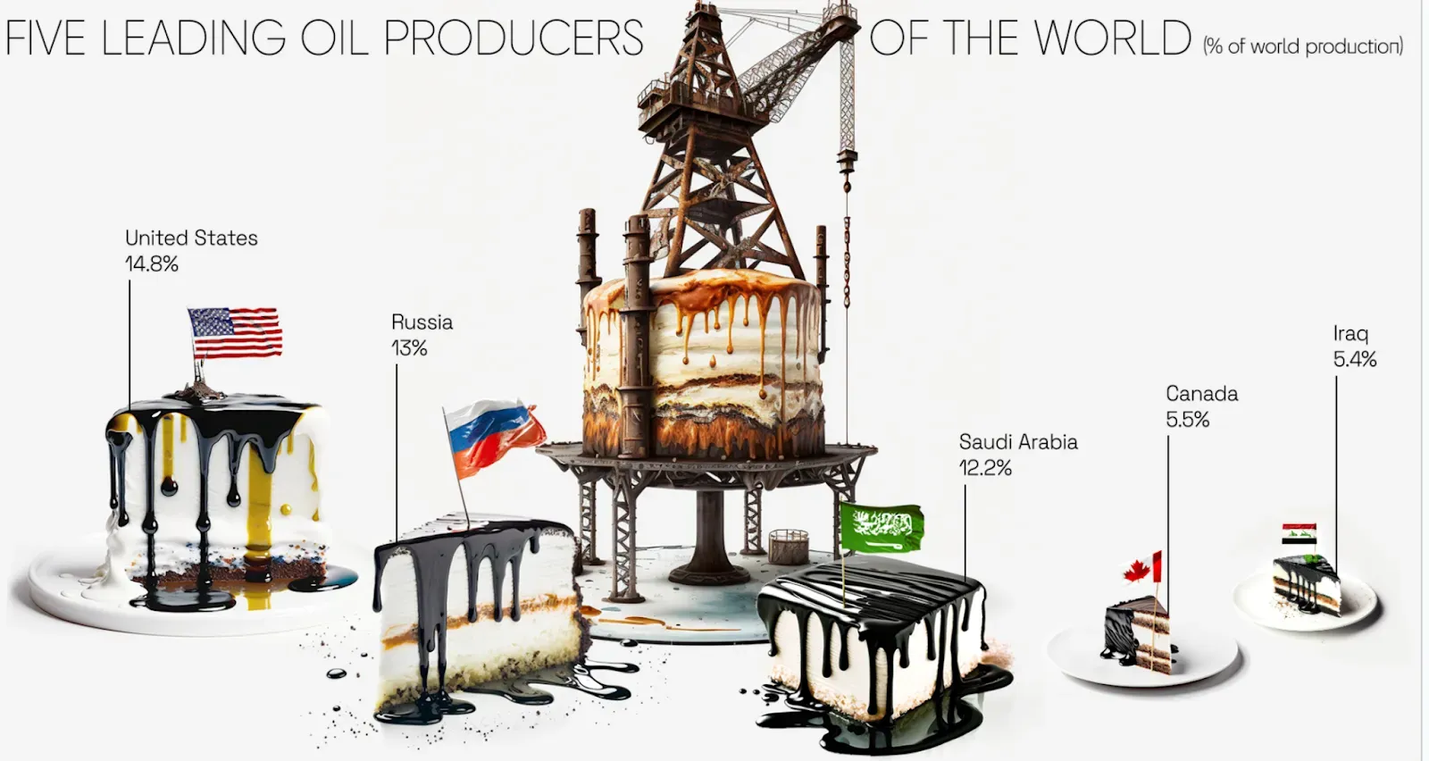
We’ve also developed systems that generate multiple visualizations quickly. These aren’t polished masterpieces, but that’s kind of the point. In about two hours, using tools like Midjourney and Google Slides, we produced data representations that, while imperfect, showed the potential of these tools.
Shown below are a few images of these quick drafts. They let us explore our ideas without overthinking: often, the best insights come when you’re not trying too hard — happy accidents do happen.
Explore more here.
BEYOND WORDS: THE ENDURING POWER OF DATA VISUALIZATION
All of this brings me to a question that Paolo Ciuccarelli asked during one of our conversations — a question that left me pondering: “Is visualization still relevant when we have much easier ways to extract insights from data through conversational systems like ChatGPT?”
It’s a fair point. With AI models that can digest and regurgitate data insights in plain language, one might wonder if visualizations are becoming obsolete. But here’s my take: absolutely not. Visualization is still a thing, and will be so for the foreseeable future.
Visualization isn’t just about representing data; it’s about offering a perspective that might be impossible to grasp through words alone. Think of it this way: trying to understand complex data solely through text is like trying to appreciate a painting by reading a written description of it. Sure, you get the gist, but you miss the nuances — the colors, the brushstrokes, the emotions it evokes.
Visualizations provide a different language, one that can reveal patterns and insights hidden beneath layers of numbers and statistics. They engage our visual cognition, allowing us to see relationships and anomalies that might elude textual analysis. It’s not just about making data look pretty (though that’s a nice bonus); it’s about making data accessible and meaningful on a human level.
We need more languages to understand reality than just the symbolic ones. Words and numbers have their place, but they can’t capture everything. Sometimes, a single image can convey what pages of text cannot. Visualizations offer that alternative language — a way to bridge the gap between complex data and human intuition.
In a world increasingly saturated with information, having multiple ways to interpret and understand data isn’t just helpful — it’s essential. Visualizations can simplify the complex, highlight the overlooked, and make the abstract tangible. They invite exploration and can even spark joy — or at least a satisfied nod of understanding.
So yes, even with conversational AI tools at our fingertips, visualization remains a vital tool in our arsenal. It complements these technologies by providing a different angle of approach, enriching our understanding rather than replacing existing methods.
References:
¹ Hakim Bey. T.A.Z.: The Temporary Autonomous Zone, Ontological Anarchy, Poetic Terrorism. Autonomedia, 1991. The term “Cartesian anesthetic gas” is used to convey a subtle indifference to lyricism and human subjectivity.
² Bertin, J. (1983). Semiology of Graphics: Diagrams, Networks, Maps (W. J. Berg, Trans.). University of Wisconsin Press.
³ Jansen, Y. (2014). Physical and Tangible Information Visualization (Doctoral dissertation, Université Paris-Sud XI).
