“In today’s media landscape, what captures the headlines often isn’t what’s most prevalent but rather what’s most sensational. This bias becomes evident when comparing the media representation of two tragic events that occurred on the same day in 2004 in the far north of Sweden.
Mari Larsson was 38 years old when she was killed by multiple blows to the head from an axe. It was the night of October 17, 2004. Mari’s former partner had broken into her house in the small town of Piteå in the north of Sweden and was waiting for her to come home. The tragic and brutal murder of a mother of three was barely reported in the national media, and even the local newspaper gave it only modest coverage.
That same day a 40-year-old father of three, also living in the far north of Sweden, was killed by a bear while out hunting. His name was Johan Vesterlund and he was the first person killed by a bear in Sweden since 1902. This brutal, tragic, and, crucially, rare event received massive coverage throughout Sweden.
In Sweden, a fatal bear attack is a once-in-a-century event. Meanwhile, a woman is killed by her partner every 30 days. This is a 1,300-fold difference in magnitude. And yet one more domestic murder had barely registered, while the hunting death was big news. Despite what the media coverage might make us think, each death was equally tragic and horrendous.
Despite what the media might make us think, people who care about saving lives should be much more concerned about domestic violence than about bears. It seems obvious when you compare the numbers.” (Rosling, 2019)
After coming across this powerful story, we were inspired to investigate just how deep this media bias runs. In May 2023 this led us to design an art installation as part of the Sade exhibition at the CCCB. Marquis de Sade, often polarising in his views, inadvertently emerged as a symbol of the formidable influence of the written word, showcasing its capacity for both liberation and devastation. This duality is ever present in today’s media landscape, where the influence of the press on public perception is unparalleled. Our art piece, The Rhythm of Violence, was intended to not only shed light on the pervasive nature of violence against women but also to challenge the conventional methods of data representation.
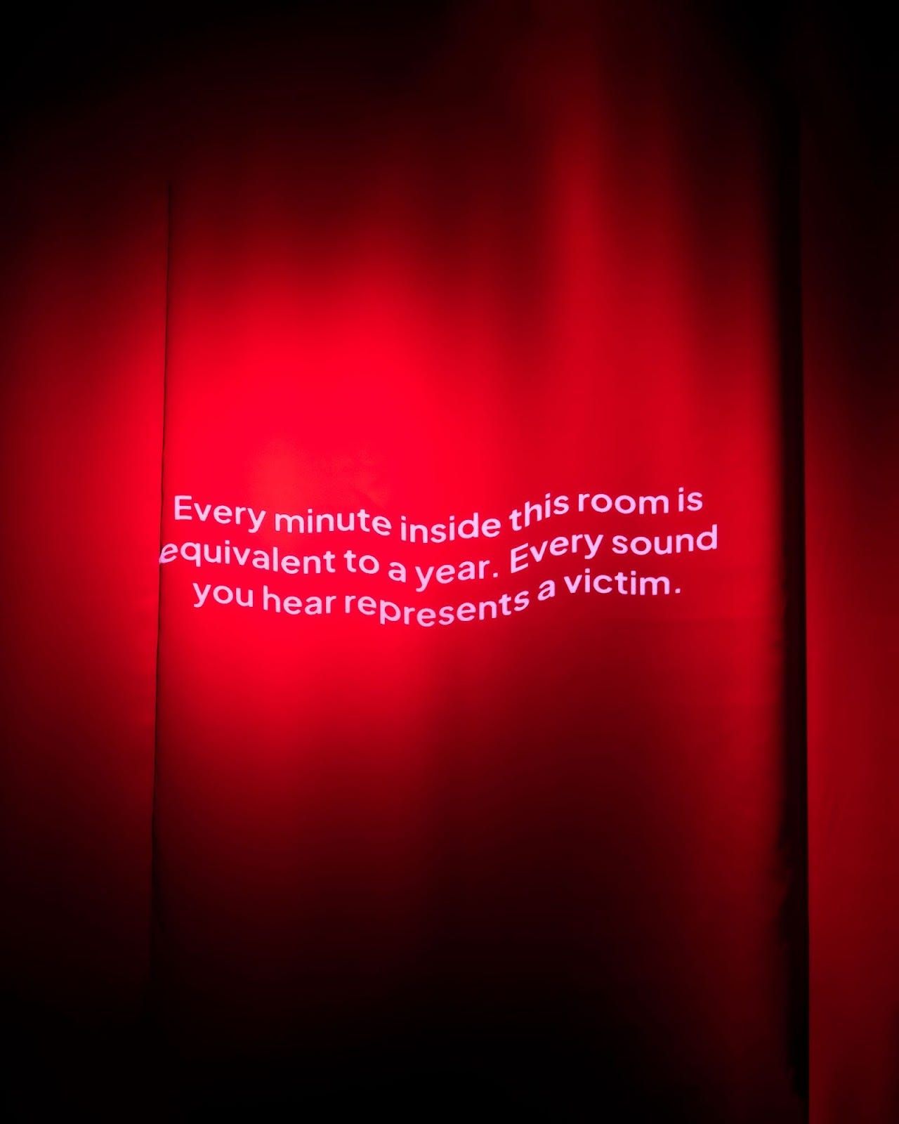
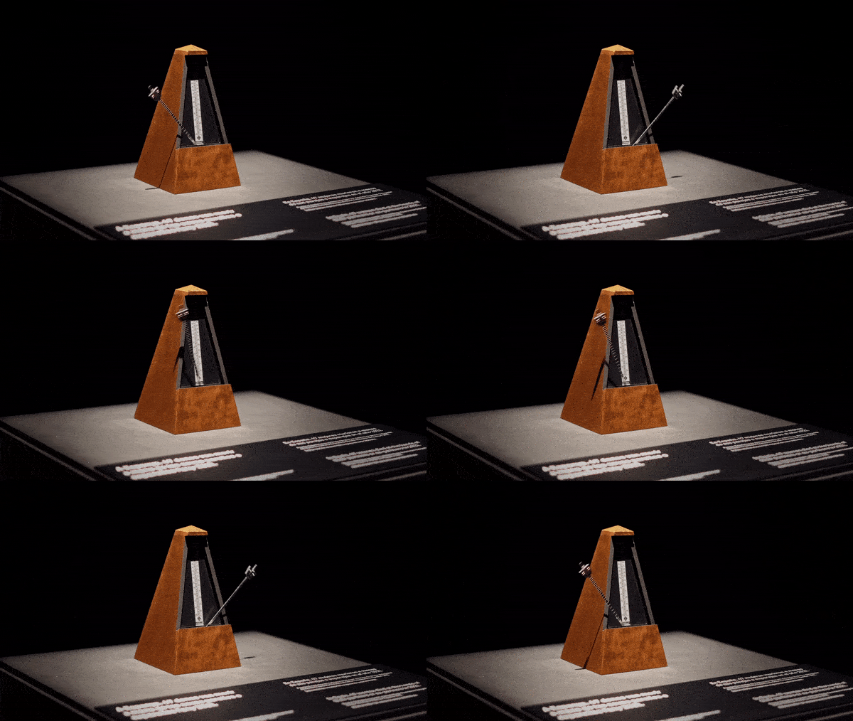
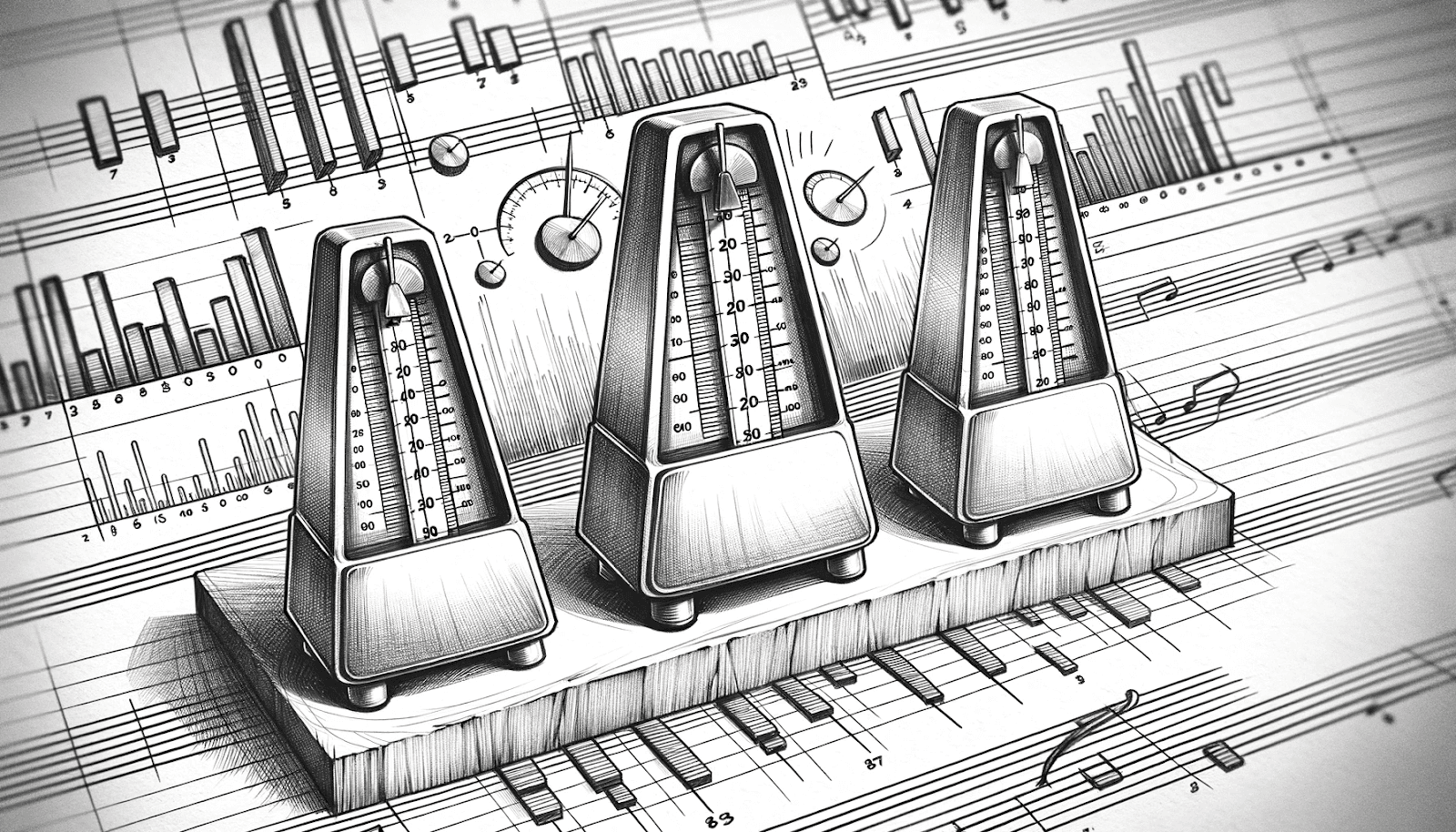
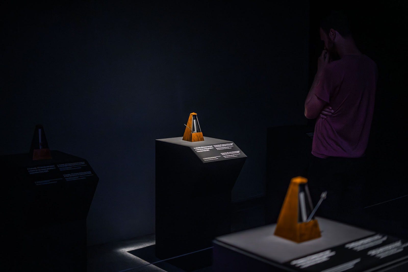
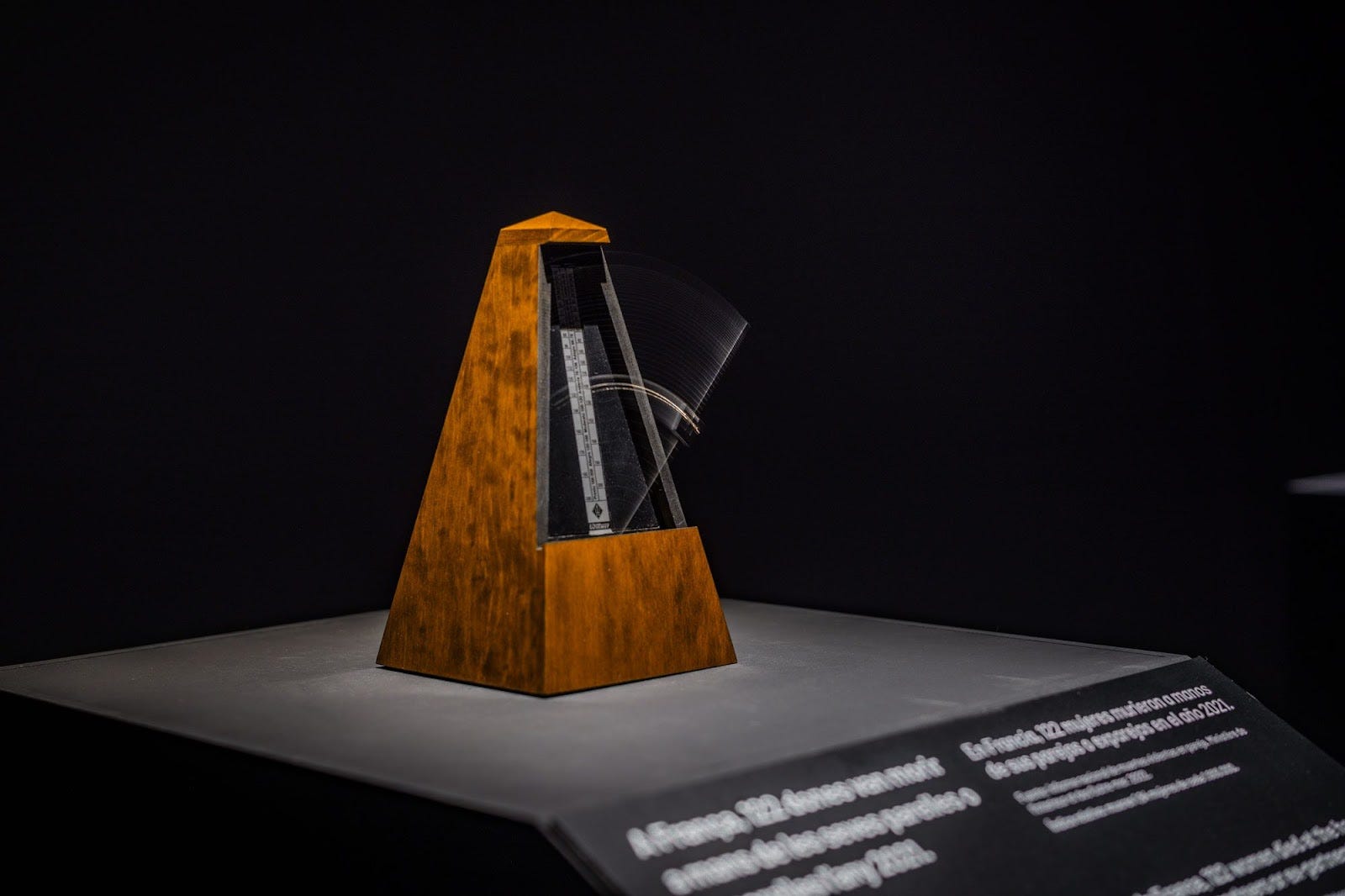
In the darkened room where you find this artwork, every minute is a year, and every tick of the metronome is the death of a woman at the hands of her partner or ex-partner. Each metronome represents a different country and emphasises the constant and prolific nature of this violence through sound.
But beyond the audible and the visual, the art piece also challenges the visitor’s emotional sensibilities. The dissonance created by the metronomes is intentionally jarring, forcing one to confront the discomfort and acknowledge the gravity of the situation.
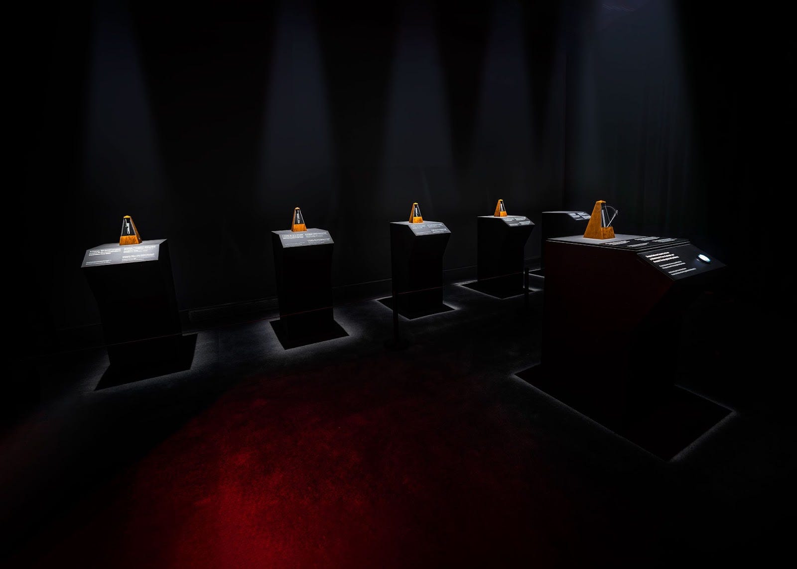
In 2021, Colombia witnessed the deaths of 210 women at the hands of their current or former partners. England reported 158 such deaths, while France had 122. Canada saw 173 women die in similar circumstances. In 2020, Hungary recorded 154 women killed by partners or family members. Astonishingly, reliable statistics on this form of male violence are absent in ten EU nations.
The absence of mortality data from several European countries shows the extent to which this crisis, which the World Health Organisation describes as an epidemic, is being hidden from the public, who are unable to perceive its true scale.
The figures, as grim as they are, reveal only a portion of the problem. More locally, in Barcelona, it’s estimated that male violence impacts approximately 141,350 women annually, which breaks down to 16.13 instances every hour. (Source: Avaluació del Circuit Barcelona contra la Violència Masclista. 2017 )
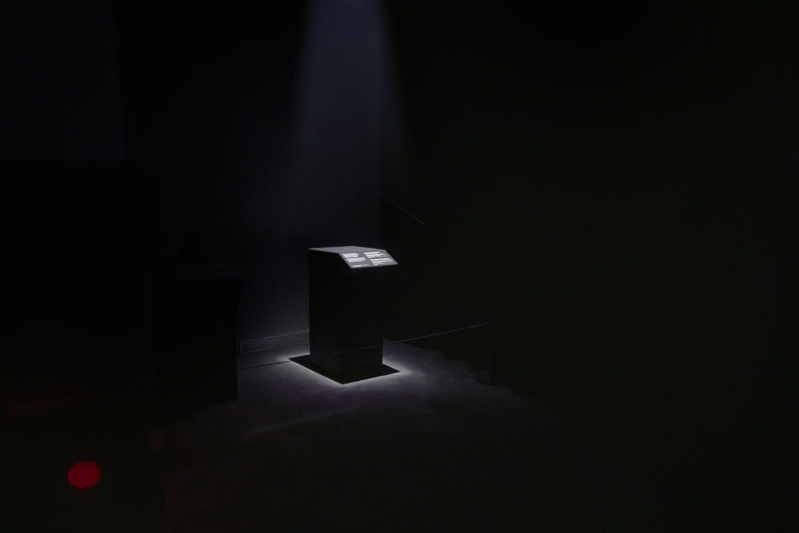
As the piece concludes and the cacophony of metronomes falls silent, we are left to consider a final empty podium that represents all those victims who do not appear in official statistics.
Some facts need more than numeric representations to be understood; numbers, bar charts, and infographics cannot be the only way to represent realities.
“Most of us need to listen to the music to understand how beautiful it is. But often that’s how we present statistics: we just show the notes, we don’t play the music.”
— Hans Rosling
As we are constantly bombarded by information and pull-out quotes in the media, it’s imperative that we pause and reflect on the stories behind the headlines and numbers. The media, in its pursuit of captivating narratives, often prioritises rarity over frequency, inadvertently overshadowing chronic societal issues with sensational anomalies. This not only skews public perception but can also lead to resources being diverted away from the most pressing, pervasive problems we face as a society.
Juxtaposing the stories of Mari Larsson and Johan Vesterlund serves as a stark reminder of this imbalance. But it is through art, like The Rhythm of Violence, that we want to bridge the cognitive gap between raw statistics and the profound human experiences they represent. By transforming cold, hard numbers into palpable sensations, art pushes us to confront realities we might otherwise overlook. It reminds us that each statistic represents an individual with hopes, dreams, and a story.
As we move forward, it’s crucial to remember that while numbers provide us with data, it’s the stories and emotions behind them that truly resonate and drive change. As inhabitants of a hectic information landscape, we must strive not only to be informed but to feel, empathise, and be spurred into meaningful action. It is only by acknowledging and addressing these disparities in representation and understanding, that we can create a more compassionate and truthful gaze.
Past use of metronomes:
The metronome, traditionally a device used by musicians to maintain a steady tempo, has, over the years, been appropriated by artists and soundscape creators. Here we’d like to give a mention to a few noteworthy examples we discovered through researching this project.
- György Ligeti’s “Poème Symphonique” (1962): One of the most avant-garde uses of metronomes in the realm of music was by the Hungarian composer György Ligeti. In “Poème Symphonique,” Ligeti used over 100 metronomes, all set at different tempos. As they wind down at different rates, the piece transforms from a cacophony of ticks into silence. It’s a profound meditation on time, order, and chaos. The performance highlighted the individuality of each metronome, much like how individual stories get lost in the noise of mass statistics.
- William Kentridge’s “The Refusal of Time” (2010): South African artist William Kentridge, known for his animated films and drawings, incorporated metronomes in his multimedia installation. The metronomes in “The Refusal of Time” symbolise the relentless march of time. Alongside videos, shadow play, and music, the ticking devices remind viewers of the inexorable and indifferent progression of time, which waits for no one.
- Varvara and Mar’s “The Rhythm o City” (2011): This innovative project repurposed metronomes to represent the heartbeat of a city. By syncing the metronomes to real-time urban data, such as traffic flow or noise levels, the artists provided a tangible, auditory representation of a city’s rhythm and pulse. It showcased how data, often cold and impersonal, can be transformed into something organic and relatable.
References
- Rosling, Hans, with Ola Rosling and Anna Rosling Rönnlund. 2018. Factfulness: Ten Reasons We’re Wrong About the World — and Why Things Are Better Than You Think. New York: Flatiron Books.
